Pausing ageing at 70: Better than a cure for cancer
If we stopped ageing at 70 years old, we could live longer than if we stopped violence, accidents, cancer and heart disease combined.
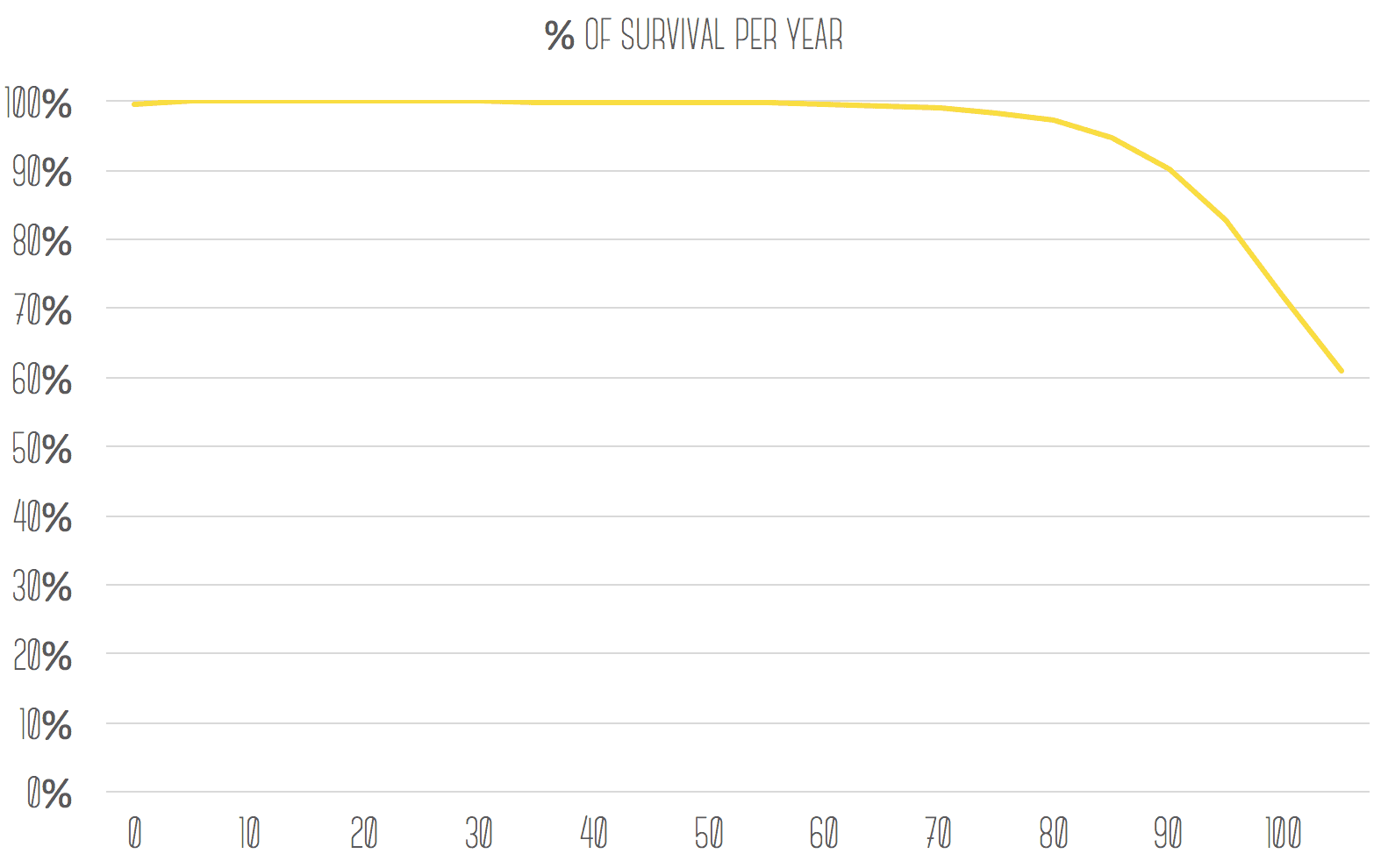
So I’ve been thinking a lot in the last year about how we are increasing our lifespans and how we can do so more effectively. I thought it would be interesting to visualise what the largest contributors are to shortening our lifespans, so I made a tool to do so here. The graph shows the yearly probability of death over your life. The numbers to the right indicate the statistical average and median lifespans of a population with the graph’s death probabilities. Have a play — see the bottom of this article for an explanation of the tool.
Insights
This may seem obvious, but it was surprising to me how much our current lifespan is limited by the degradation of our health due to ageing. If you average out the probability of death over our lifetime, our average lifespan should be about 155 years (every year around 0.6% of the population dies, so the inverse of that is the average). But because this probability is concentrated around 70–90 years old, our actual average lifespans are much shorter (current global average life expectancy at birth is around 71.5 years — my tool overestimates this due to having a bias towards developed countries which have better data availability).
Using the tool you can quickly see that if we could stop people getting worse after 70 years of age, this would increase our average lifespans by about 20 years. This is equivalent to the effect of curing all heart disease, cancer and accidents/violence (although these two scenarios have very different impacts on the median lifespan which may be a more relevant metric overall). That’s pretty remarkable. Considering how much our medical system is focused on curing heart disease and cancer it’s strange how comparatively little we spend on ageing. Curing ageing is currently mostly thought of as either some sort of cosmetic and vain pursuit or some egomaniacal moonshot.
Explanation of the tool
The probabilities in the WHO dataset are broken down by cause of death, so I added a feature where you can toggle these causes using the checkmarks beneath the graph. This allows you to see how our lifespans change if we prevent all deaths currently being caused by e.g. cancer or heart disease.
Lastly, as a point of comparison, I have added a feature where you can see how lifespans would change if we stop age-related degradation at a certain age. E.g. how long would we live if we stopped getting worse at that age. Toggle this on and off using the checkbox and change the age using the slider.
It’s my first try at building anything in Javascript so please don’t judge (and don’t use it on mobile as it will likely just look terrible and not work) — it will break in many different ways and behave strangely in various browsers. It should work best in Google Chrome.
I’ve used WHO’s 2009 mortality database for this, aggregated to get global averages. These averages are slightly biased towards longer lifespans due to the data being biased towards developed countries.
